UPDATE: Now plotting air pressure, temperature AND humidity – see end of this post!
I’ve been playing with the RaspberryPi SenseHAT to see how easy it would be to code some live data logging of environmental factors like temperature or air pressure.
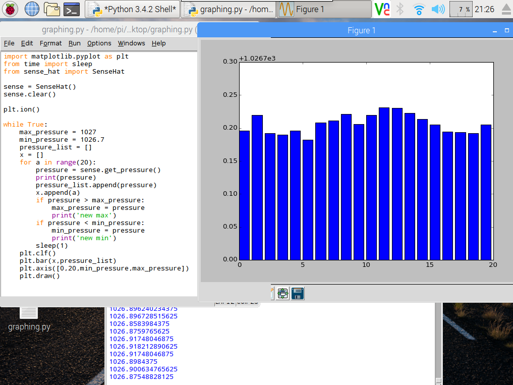
The Python matplotlib library makes it easy to plot nice graphs, and you can even update them. The Python code below takes a reading from the air pressure sensor on the SenseHAT every second for 20 seconds, and writes the readings into a list called pressure_list. It also logs the air pressure readings in the console you get a live readout which may be useful later…
It also writes numbers up 20 in a list called x to give us some numbers to go on the x-axis of our graph.
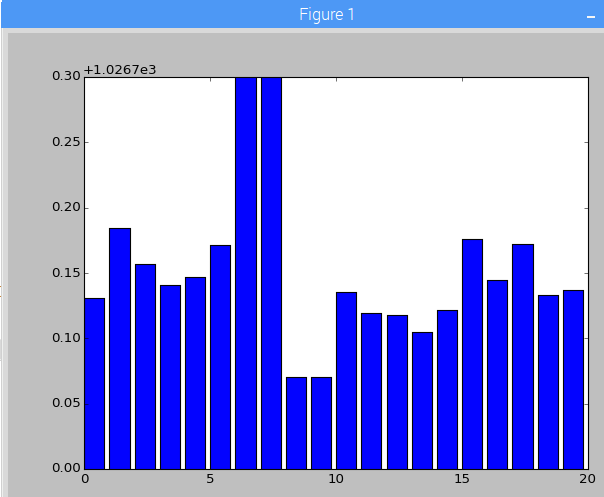
When the 20 seconds are up, it plots a bar chart of the readings, zoomed in to show only air pressures between 1026.7 and 1027 millibars – this is roughly the current range of air pressures in my lounge and the plt.axis command ensures we can easily see the differences in the bar chart. I also check to see if there are any exceptionally high or low pressure readings in each 20 second cycle, and take those into account when plotting the bar chart, though this gets reset on the next pass. You may need to fiddle with values for max_pressure and min_pressure depending on the weather!
It then repeats the process, wiping the list and starting again with 20 new air pressure readings.
Plenty still to do – the graph needs axis labels, the numbers on the Y axis are meaningless, it needs a title. You could also log the data to a CSV file, timestamp it and only display the last 20 seconds, or perhaps update a daily graph, add in temperatures and humidity too, plot line graphs, scatter charts – the possibilities are endless!
import matplotlib.pyplot as plt
from time import sleep
from sense_hat import SenseHat

sense = SenseHat()
sense.clear()     # reset the senseHAT

plt.ion()         # turn on interactive plotting

while True:
    max_pressure = 1027    # may need to tweak these numbers
    min_pressure = 1026.7  # depending on the weather!
    pressure_list = []
    x = []
    for a in range(20):
        pressure = sense.get_pressure()
        print(pressure)
        pressure_list.append(pressure)
        x.append(a)
        if pressure > max_pressure:
            max_pressure = pressure
            print('new max')
        if pressure < min_pressure:
            min_pressure = pressure
            print('new min')
        sleep(1)
    plt.clf()                      # clear the chart
    plt.bar(x,pressure_list)       # make a bar chart from the data
    plt.axis([0,20,min_pressure,max_pressure])   # zoom in the Y axis
    plt.draw()                     # make the chart appear
Can you see where I blew on it then inhaled deeply?
UPDATE
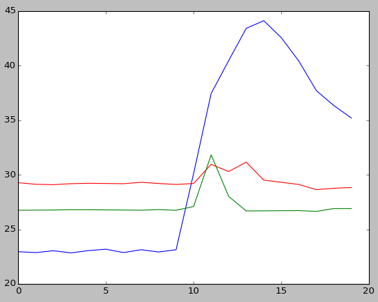
I've now tweaked the code and simplified it so it measures and plots humidity in blue, temperature in red and air pressure in green, still logging values every second for 20 seconds then updating the chart.
This program doesn't scale the Y axis according to maximum/minimum values but fudges things somewhat to get the scales right so you can see relatively small changes. It does this by subtracting 1000 from the air pressure reading and halving the humidity reading - this may not work in different weather conditions, but you can see the correlation between rise of temperature, humidity and air pressure when I blew hot, wet breath (ugh!) on the SenseHAT.
I have a few ideas where to take this project next, so watch this space...
import matplotlib.pyplot as plt
from time import sleep
from sense_hat import SenseHat

sense = SenseHat()

plt.ion()	# turn on interactive plotting

while True:
    pressure_list = []
    temp_list = []
    humidity_list = []
    x = []

    for a in range(20):

        pressure = sense.get_pressure()-1000
        pressure_list.append(pressure)

        temp = sense.get_temperature()
        temp_list.append(temp)

        humidity = sense.get_humidity()/2
        humidity_list.append(humidity)

        print(pressure, temp, humidity)

        x.append(a)

        sleep(1)

    plt.clf()
    plt.plot(x,humidity_list)
    plt.plot(x,temp_list,'r')
    plt.plot(x,pressure_list,'g')
    plt.draw()
Update to the Update!
Now with improved temperature readings and charts that grow and log data over much more time... no idea how long it'll run before crashing, though!
Here's the new code as featured in the video:
import matplotlib.pyplot as plt
from time import sleep
from sense_hat import SenseHat
import os

def getCPUtemperature():
 res = os.popen('vcgencmd measure_temp').readline()
 return(res.replace("temp=","").replace("'C\n",""))

sense = SenseHat()
plt.ion()
pressure_list = []
temp_list = []
humidity_list = []
x = []
a = 0

while True:
    pressure = sense.get_pressure()-1000
    pressure_list.append(pressure)
# attempt to calculate ambient temperature
# based on dgaust in https://www.raspberrypi.org/forums/viewtopic.php?f=104&t=111457
    cpuTemp=int(float(getCPUtemperature()))
    ambient = sense.get_temperature_from_pressure()
    calctemp = ambient - ((cpuTemp - ambient)/ 1.5)
    temp_list.append(calctemp)

    humidity = sense.get_humidity()
    humidity_list.append(humidity)

    print(pressure, calctemp, humidity)

    x.append(a)
    a = a + 1
    sleep(1)

    if a / 10 == int(a/10):
        plt.clf()
        plt.plot(x,humidity_list)
        plt.plot(x,temp_list,'r')
        plt.plot(x,pressure_list,'g')
        plt.draw()


Hey Mate,
thank for your post, i am trying to do exactly the same thing with my RPi3.
I copy paste your code in a text file and execute using the terminal.The program run properly, but the graphic windows pop up blank and never update…
I am know to RPI3 and python.
any chance you know what is wrong?
Cheers
Medie
Hi there – I’d need to try this with a RPi3 and a SenseHAT to be sure – I will see if I can do this soon and see if I get the same result.
Apparently it’s a thing…. I’ve been trying to graph temp data with my RPi3 as well and always get a blank graph window. I tried this example and it as well gave me a blank window.
Hi. I’ve been trying to find some way to get graphical results displayed for my SenseHAT data. I found your website, and it seemed promising, but it just gives the usual text output in Thonny, no graphs at all. I was wondering if you might know what the problem might be with the three scripts on the page. It’s from 2016, so I’m guessing that might have something to do with it; I vaguely recall another item I downloaded a while ago needing this and that and a bit of the other altered so it would get along with the latest updates. Unfortunately, that’s pretty much the limit of my technical know-how on this.
Fair warning, bit of a newbie here, and minimal knowledge of scripting/coding/etc.
Thanks
Hi Brett – I’ve not used my SenseHAT for many years nor have I used matplotlib in that time either. so I’m afraid I’m unlikely to be much help. I assume it creates graphs as PNG files so one guess is that it might be some permission issues writing files, but as that code is now over 5 years old it’s possible that there are other issues with the way the libraries used have been updated.
Good luck!